I found that the solution proposed there, i.e., to delete the line
CLUTTER_PAINT=disable-clipped-redraws:disable-cullingfrom the file
/etc/environmentworked for me. Logging out and back in after that change gave me a stable display.
CLUTTER_PAINT=disable-clipped-redraws:disable-cullingfrom the file
/etc/environmentworked for me. Logging out and back in after that change gave me a stable display.
$ curl -O http://awebsite.net/uploads/manuscripts/miscellaneous/sometext/[001-268].jpg
$ convert *.jpg Hayanaratna.pdfand wait for ten seconds.
You can also usexinputto modify the libinput values directly:
Runxinputto show the pointers the system knows about. If you have a ThinkPad you should see something along the lines ofTPPS/2 IBM TrackPointor similar.
xinput --set-prop "TPPS/2 IBM TrackPoint" "libinput Accel Speed" -0.5
will modify the pointer speed. Play around with the value to see what you like. If you want this to survive a reboot you can stick this in .bash_profile.

> pdftk foobar.pdf burst
#!/bin/bash
# convert a directory full of pdfs into jpegs
for i in *.pdf; do pdftoppm -jpeg -r 400 "$i" >"$i.jpg"; done
#!/bin/bash
# Create a PDF file from all the .tiff files in the current directory.
# The argument provides the name of the output file (with .pdf appended).
echo "Created a PDF from a directory full of .tif files"
echo "Single argument - the filename of the output PDF (no .pdf extension)"
tiffcp *.tif "/tmp/${1}.tiff"
tiff2pdf "/tmp/${1}.tiff" > "${1}.pdf"
echo "Created ${1}.pdf"
rm "/tmp/${1}.tiff"
echo "Removed temporary file /tmp/${1}.tiff"
# thanks to http://ubuntuforums.org/showthread.php?t=155628
Innocent people may be pulled from the line at the boarding gate and subjected to manual fingerprinting at higher rates as a result of their complexion or gender.The technology being compulsorily applied to all non-USA citizens is demeaning, invasive and violates an individual's right to privacy.
When writing an article or book using the LaTeX document preparation system, Indologists sometimes want to have a śloka or two printed on the page with some text-critical notes. A famous example of this kind of layout is Wilhelm Rao's 1977 edition of the Vākyapadīya that edits the whole text this way, in each verse having its own mini-critical-edition format.
Here is a simple way to get this kind of layout in LaTeX. I create a new environment called "miniedition":
\newenvironment{miniedition}
{\begin{quote}
\addtolength{\textwidth}{-\rightmargin} % width of the quote env.
\begin{minipage}{\textwidth}
\itshape
\let\footnoterule\relax}
{\end{minipage}
\end{quote}}
This puts a minipage environment inside a quote environment, switches on italics and switches off the footnote rule. It's pretty simple. The clever bit is done by the minipage environment itself, that makes footnotes inside its own box, not at the bottom of the page. The footnote numbers are lowercase alphabetical counters, to avoid confusion with footnotes outside the environment.
Here's how you would use it, and the result:
\begin{miniedition}
pāraṃparyād \emph{ṛte ’pi}\footnote{N: \emph{upataṃ}?} svayam
\emph{anubhavanād}\footnote{My conjecture; both manuscripts are one syllable
short. K:
\emph{anubhavad}; N: \emph{anubhavād}.} granthajārthasya samyak\\
pūrṇābdīyaṃ phalaṃ sadgrahagaṇitavidāṃ \emph{aṃhrireṇoḥ}\footnote{N:
\emph{aṅghri-},
with identical meaning.} \emph{prasādāt}\footnote{N: \emph{prasādaḥ}.}||
\end{miniedition}
Output (with added text before and after:

\begin{document}This will print your footnoted citations in ascending order of year, and your bibliography in ascending order of author.
\usepackage[sorting=ynt,sortcites=true]{biblatex}
\AtBeginDocument{\assignrefcontextentries[]{*}}
\begin{document}
Hello world!\footcites{ref1,ref3,ref0,ref4}
\newrefcontext[sorting=nyt]
\printbibliography
\end{document}
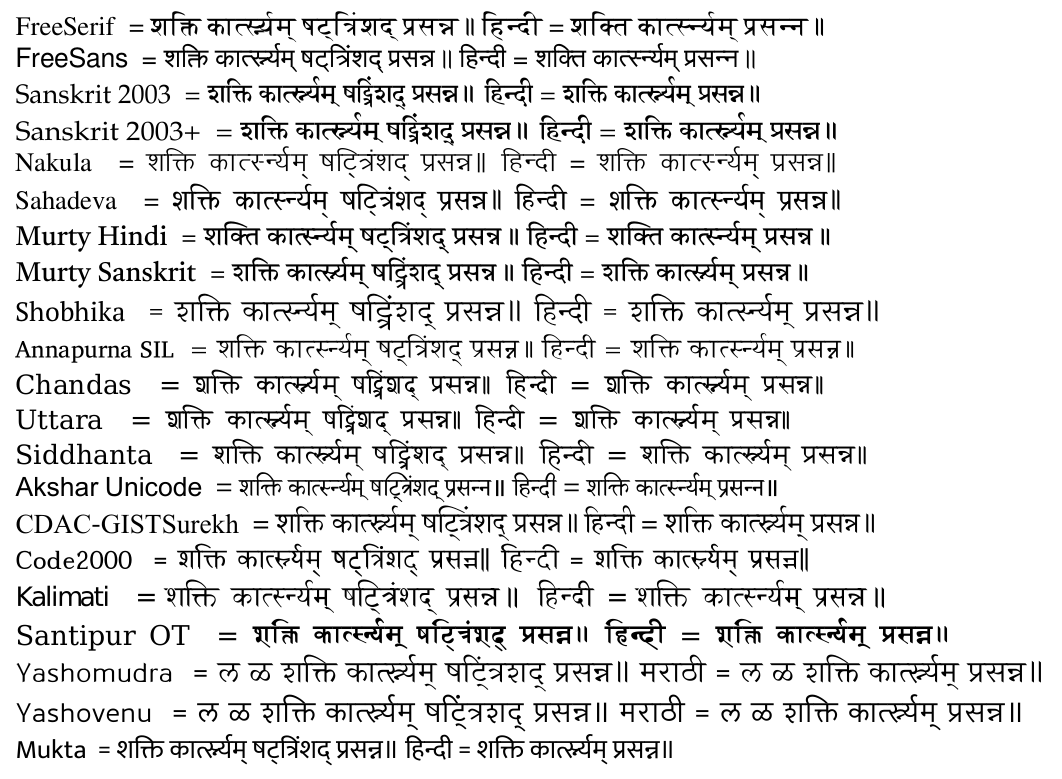
Here's an update, with some more fonts and more concise TeX code:
\documentclass{article}
\usepackage{polyglossia}
\defaultfontfeatures{Script=Devanagari,Language=Sanskrit}
\newfontfamily\eng{TeX Gyre Pagella}
% set up a font, print its name, and typeset the test text:
\newcommand{\FontTrial}[1]{ %
\setmainfont[Mapping=RomDev]{#1}
\renewfontfamily\eng{#1}
% print the font name:
{\eng #1} \TestText }
\newcommand{\TestText}{ = शक्ति, kārtsnyam ṣaṭtriṃśad;
{\addfontfeatures{Language=Hindi} Hindī =
शक्ति कार्त्स्न्यम्}\par}
\begin{document}
\FontTrial{FreeSerif}
\FontTrial{FreeSans}
\FontTrial{Sanskrit 2003}
\setmainfont[FakeStretch=1.08,Mapping=RomDev]{Sanskrit 2003}
\renewfontfamily\eng[FakeStretch=1.08,Language=English]{Sanskrit 2003}
{\eng Sanskrit 2003+} \TestText
\FontTrial{Nakula}
\FontTrial{Sahadeva}
\FontTrial{Murty Hindi}
\FontTrial{Murty Sanskrit}
\FontTrial{Shobhika}
% ... etcetera
\end{document}
Output:
Thus Principle Number One is Aristotelian: "Do not make your datum more accurate than it is. This principle may be rephrased as, "Preserve the Mess."
Relative size of numerals in tables.-- André says on this point: "In certain numerical tables, as those of
Schrön, all numerals are of the same height. In certain other tables, as those of Lalande, of Callet, of Houël, of Dupuis, they have unequal heights: the 7 and 9 are prolonged downward; 3, 4, 5, 6 and 8 extend upward; while 1 and 2 do not reach above nor below the central body of the writing.... The unequal numerals, by their very inequality, render the long train of numerals easier to read; numerals of uniform height are less legible." (D. André, Des notations mathématiques (Paris, 1909), p .9).
export IBUS_ENABLE_SYNC_MODE=0Copy the file ibus-setting.sh to the directory /etc/profile.d/, like this:
sudo cp ibus-setting.sh /etc/profile.dMake the file executable, like this:
sudo chmod +x /etc/profile.d/ibus-setting.shLogout and login again.